Redesigning Sweet Tooth’s Online Presence

Responsive website concept that simplifies the ordering process for a local bakery
ROLE & TEAM
I worked as a UX/UI Designer (Research, Experience Strategy, Interaction Design, Prototyping, Testing) with a UX/UI Designer mentor. I presented and defended my designs to groups of other designers in weekly design critiques as part of a UX boot camp each week.
TOOLS
Figma, Miro, Zoom, Maze
DURATION
4 weeks
PROBLEM AND CHALLENGE
Due to the pandemic and limited access to delivery services, the bakery needed a new way to connect with customers.
As a new business to Door Dash, they only have access to residences within a 2-mile radius and are about 5 miles away from the closest residential areas.
SOLUTION
A responsive website that allows users to easily order baked goods online for pick-up at the bakery.

Preview of final prototype
RESEARCH
How has the pandemic impacted the bakery and its customers?
Sweet Tooth’s Goals: Modernizing their online presence to attract the next generation of customers and safely provide baked goods to customers
Sweet Tooth is a family-owned bakery in Capitol Heights, MD and has been operating since 1996. I interviewed Sweet Tooth to discover their business goals and how they’ve been impacted by the pandemic. Their goals included:
Having a modern website that effectively communicates baked goods and attracts the next generation of customers
They have a loyal customer base but are interested in expanding their customer base. They want a better way to communicate their new products, e.g. their new vegan options.
Finding ways to safely provide baked goods to customers in further areas because of Door Dash’s delivery limitations
The bakery is located in a commercial area which was great when employees who worked nearby could walk-in prior to the pandemic. However, with residential areas outside of Door Dash’s delivery radius, they have to find new ways to outreach.
Customer Goals: Feeling confident with their choices in local bakeries
During the business interview, the business expressed how it wanted to expand its customer base to a younger audience. With this, I narrowed my interviewee demographic to people in their 20s who love bakeries and continued to support local, small bakeries in the DC metro area during the pandemic. I interviewed 3 participants about their experiences with bakeries and experiences with bakery websites.
The interviewees found the following important to their bakery experience:
3/3 believe the ambiance and feelings of familiarity are key to establishing loyalty.
Users want to feel relaxed and welcomed when visiting a bakery. Bakeries were places that represented comfort before and during the pandemic.
🏠 “Feeling warmth and care from having a fresh pastry” “Relaxing, meditative, cozy”
3/3 want to see endorsements/reviews of bakeries.
It’s ideal if the business has a responsive website and/or are on social media, so they can easily learn about the bakery.
⭐ “I use Yelp a lot to find bakeries” “Stood out because it had a lot of good reviews”
2/3 enjoy supporting local bakeries.
People want to support businesses they can trust and want to feel like their money spent is worth it.
💲 “Pricier to go to small local bakeries, but what you’re getting is quality and worth the money”
INTERACTION DESIGN AND PROTOTYPING
How can the website be designed so that it prioritizes both the business and customer goals?
Prioritizing design decisions with business and user goals in mind
Since I had interviewed the business and potential customers, I had a good sense of where their goals intersect. I prioritized design decisions that met the two groups’ goals:
Responsive website: Allow customers to easily order online for pick-up on different device sizes
Yelp reviews: Build bakery loyalty and trust
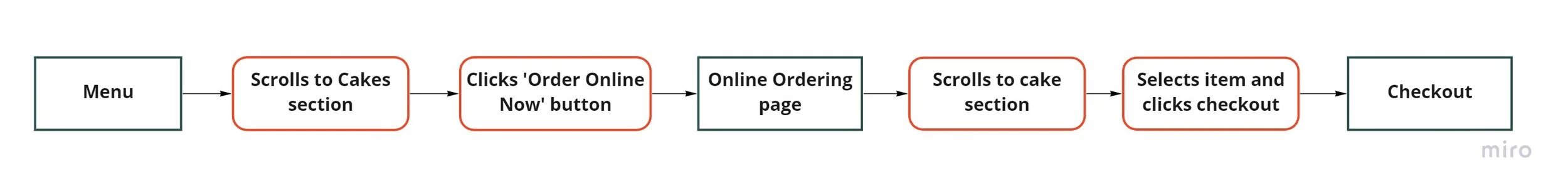
Redesigning a new online ordering task flow
Currently, there is an “Online Order” button under each bakery section of the menu. However, when users click this button, they need to search for the item again in the Online Ordering screen before they can place an order.
Current online ordering task flow
To redesign this flow, I combined the menu browsing and online ordering processes under the Menu page and designed different product pages for each product type to reduce the time it takes for customers to find an item and place an order.

New online ordering task flow
Prototyping
After reviewing design patterns of local bakeries and coffee shops, I sketched and designed wireframes for the desktop, tablet, and mobile versions of the landing page. The prototype would be tested in desktop, so I also designed additional desktop screens.
USABILITY TESTING AND ITERATIONS
How can user feedback inform design revisions?
Usability testing and feedback
I conducted usability testing with a lo-fi prototype with 3 participants. Throughout testing, I asked participants questions to measure the usability of the online ordering process and gather feedback that would guide my priority revisions to improve the site.
To analyze patterns, I mapped out user feedback on an affinity map. I took the common issues from the affinity map and turned them into actionable design revisions using the prioritization matrix below.
Priority revisions
Menu and Order Online
Checkout

Lessons
Don’t reinvent the wheel — Lean on design patterns to ensure familiarity.
I tried to combine the menu page and the online ordering page into one page because I thought it would simplify the process. However, users were used to seeing the menu and online ordering pages as two separate pages, and were more familiar with static online menus. In the future, I will prioritize more design pattern research when designing prototypes.
Make it easier for users to make quick decisions by using more visuals than text.
Participants expressed that too many words on the menu page made it harder for them to skim and order the right item quickly. When it comes to ordering food, photos are essential. Next time, I know to prioritize more visuals even in a lo-fi prototype to help users choose items quickly and easily.
Next steps
Conduct more usability tests
If I had more time, I would conduct additional user testing to see if more revisions need to be made or if the revisions are helpful. I would also test a mobile prototype to ensure that the mobile site is truly responsive.
Present website to business
I would present the website to the business to see if any changes need to be made to the online ordering system to make it more feasible for the business.